COLOR MANAGEMENT
Basic Color Theory
The real challenge of printing or displaying color images accurately is that we are attempting to approximate the colors of the real world using devices or technologies that are not capable of reproducing anywhere near all the colors in the visible spectrum.

The visible spectrum includes wavelengths from about 400nm to about 700nm.
Furthermore, some of the technologies we choose are more capable than others. For example, a computer monitor generally does a much better job of simulating real color than an inkjet printer does. This is one reason why we need Color Management. Color Management helps us get the most accurate color output possible from whatever process or device we are using.
Color Models
There are several different color models or color spaces to help us describe and reproduce color. These color models allow us to specify colors using physical representations and numeric values. The following section summarizes the color spaces most commonly used in graphics reproduction.
A note about “accurate color”:
We will see that “accurate” is itself a subjective term. In fact, our customers often don't want accurate colors. They want “extreme” or fluorescent colors that draw attention at a trade show. However, for the time being we will use accurate to mean colors that are as close to the real world as possible.
RGB and Additive Color
The Red, Green, Blue (RGB) color space approximates the way the human eye works. It is used to create color on TVs and computer screens, on photographs, and other digital output devices. Digital cameras and scanners capture color data in the RGB space.
RGB is called additive color because it "paints" with light. We use this model because the three wavelengths of the RGB primaries more or less correspond to the signals that are transmitted from the eye to the brain. We see in RGB.

Mixing RGB primaries produces secondary colors
Computer monitor technology provides a good example of how RGB makes color. The monitor fires three electron guns at the screen, one for each primary color (R, G, and B). If all three are mixed at full strength, the combined RGB primaries will produce white.
- Mixing Red & Green at full strength results in Yellow.
- Mixing Red & Blue at full strength results in Magenta.
- Mixing Blue & Green at full strength results in Cyan.
Not coincidentally, these are the primary colors of another color space, CMY, which we will discuss in a moment.

Specifying Cyan in Photoshop
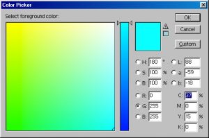
RGB is a three-dimensional color space and any color within the space can be described using three numbers. We can represent Cyan, for example, as R = 0, G = 255, B = 255.
One of the main challenges in inkjet printing is that photoimages (TIFF files, for example) are usually captured in RGB, but will ultimately be rendered in CMYK. Since the characteristics of these two spaces are quite different, we need to convert the image - usually from RGB to CMYK - in a way that maximizes the capabilities of the CMYK printing process. But before we get ahead of ourselves, let's move on to the CMY(K) color model.
Speaking of Photoshop . . .
In Adobe Photoshop® and other graphic applications, levels of the RGB primaries are described in a range from 0-255, rather than a percentage from 0-100%. When all three primaries are at 255, the screen should be white. When all three primaries are at 0, the screen should be black. When all three primaries are shown at any equal value, the screen should display a neutral gray.
CMYK and Subtractive Color
Cyan, Magenta, and Yellow (CMY) is the color model used for most printing devices that print with ink (usually in the form of CMYK). This includes offset presses, inkjet, and electrostatic printers. The CMY color space is the theoretical opposite of the RGB color space, but it is also complementary to it.
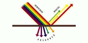
Rather than adding the primaries together to create new colors, CMY subtracts colors from white. White is composed of all colors combined. In the CMY scenario, we begin with white paper, which is in theory the full spectrum color palette. We see white because incoming light is reflected off the paper back to our eyes. With no ink on the paper, we will see all of the white reflected. When we print with a specific shade of ink, some of the spectrum is absorbed by the ink, and the rest is reflected to our eyes. Put another way, each of the CMY primary colors acts as a filter, which absorbs a specific wavelength and reflects the rest back to our eye.

Incoming light is filtered by CMYK inks, allowing the unabsorbed colors to be reflected to the eye.
This is where the complementary relationship between CMY and RGB comes into play. As shown in the chart below, each of the CMY primaries absorbs one the of the RGB primaries, leaving us to "see" the other two. Cyan absorbs Red, so what we see is the Blue and Green that is reflected back.
| CMY Primary | Absorbs | Reflects |
| Cyan | Red | Green/Blue |
| Magenta | Green | Red/Blue |
| Yellow | Blue | Red/Green |
Problems with CMY and CMYK
One of the difficulties with the CMY model is that real life physical inks are less efficient at creating colors than RGB processes, which use light. In addition, some CMY primary colors - notably Cyan - are less efficient than others. These conditions are due to several factors, including variations in raw materials and manufacturing processes. In most cases (but not all), creating colors in a RGB space allows us a wider color gamut than creating colors in CMY.
We can see this quite clearly when we begin to mix secondary colors using CMY. You will recall that when we mixed RGB primaries in equal percentages, we got a neutral gray of some sort. However, when we mix equal parts of CMY, we don't get a neutral gray. We get a gray with a color cast. If we want a neutral gray to print in CMY, we must compensate for the fact that Cyan is weaker than Magenta and Yellow. For example, a 25% neutral CMY gray is often specified as C=25, M=17, Y=17 for offset printing. This is another hint as to the problems involved with printing RGB image originals in CMY.
 |
 |
|
| Gray made from equal values of 25% CM and Y |
Gray made from C=25% M=17% and Y=17% |
Obviously, these inefficiencies are a factor when it comes to mixing secondary colors with CM and Y. The "RGB" secondary colors we generate using CMY inks will clearly not correspond to the more ideal color combinations we generate with "real RGB". For example, the Red created by mixing Magenta and Yellow inks will not match the Red primary on a color monitor. However, we can improve our results using color correction and color management methods.
 |
 |
|
| This "RGB" Red is R=255,G=0 and B=0 |
This "CMY" Red is C=0, M=100% and Y=100% |
The "K" in CMYK
Finally, if we mix all three CMY primaries at 100% each, we should get pure black, but in real life, we don't. We get a brownish-gray. This is why Black ink - represented as "K" - has been added to the printing process. We need a "real" black in order to render the deep shadow areas that CMY combinations can't handle. We also need K in order to print "real" black text and linework. Combined with CM and Y, the K channel completes the CMYK color space.
Once again, we can describe a color in the four dimensional CMYK color space by using a series of four numbers, each of which is a percentage of a primary. The orange shown below is represented as C=0, M=64, and Y=86. These numerical specs are a useful way to describe color, but they are still relative. The color of CMY inks vary dramatically, meaning that a wide range of secondary colors will be produced by mixing the same percentages of different brands, and in some case different batches of the same brand.
Although devices that use the RGB color model generally have a wider color gamut than those using CMYK, the additional K channel provides quite a bit of flexibility in controlling tone range on a printed image. Understanding and controlling the behavior of the Black channel is a major advantage in image quality control.
Inks Beyond CMYK
In the past couple of years, HI-FI and extended gamut inkjet printers have been introduced that add other primary colors to the basic CMYK. This process began with the addition of Orange and Green; the latest models offer other options such as Blue and Red, or even Turquoise, or spot colors on the latest fabric printers.

This orange is specified as C=0, M=64, and Y=86, but it won't look the same when printed on an offset press as it will on an inkjet printer. In fact it will even look different when printed on different inkjet devices unless we apply color management.
The Bottom Line
What we really need to handle all of these different inks and output devices is a standard color model where the numeric color description values are universal. There is such a thing and Wasatch makes it pretty easy to apply in a practical way.
What does this mean for Wasatch SoftRIP users?
This is interesting, but you probably don't need to know it to get great results from SoftRIP. While it is advantageous to know as much about digital color science and reproduction as possible, SoftRIP is designed to adjust for almost any level of user knowledge. Wasatch offers extremely sophisticated controls for ICC workflows, spot color replacement and Hi-Fi color configurations, but it is quite possible to produce great commercial prints everyday using our basic controls.
Adobe and Adobe Photoshop are registered trademarks or trademarks of Adobe Systems Incorporated in the United States and other countries.
All other trademarks are the property of their respective owners.
